


What do Amazon, Baskin-Robbins and Toblerone have in common? They all have hidden messages in their logos. Here's what they are and what they mean.

38 Hidden Messages in Logos You See All the Time
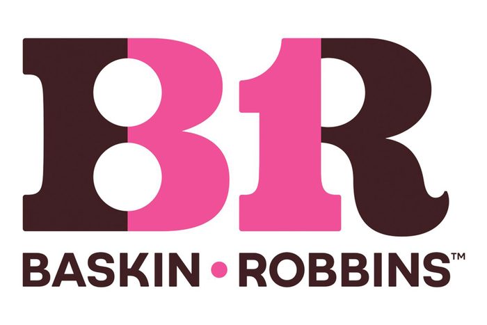
Baskin-Robbins
Baskin-Robbins is known for its ice cream, but did you know there’s a hidden message in its logo? “The ‘BR’ in the Baskin-Robbins logo has a—not very well—hidden ‘31’ in it,” says Jaclyn Hesse, co-founder of the branding firm Taillight. “This, of course, ties directly to what was their tagline for many years, and one of the key things they’re known for: having 31 flavors.” Why 31 flavors? It’s the number of flavors the company began offering in 1953: one for every day of the month, so you could try something new every day.
These days, the company has way more than 31 flavors—more than 1,400!—but that 31 hearkens back to the company’s roots and adds a little bit of nostalgia. In 2022, the company unveiled a new logo (its first major refresh since 2006), but you can still spot the 31 in it.
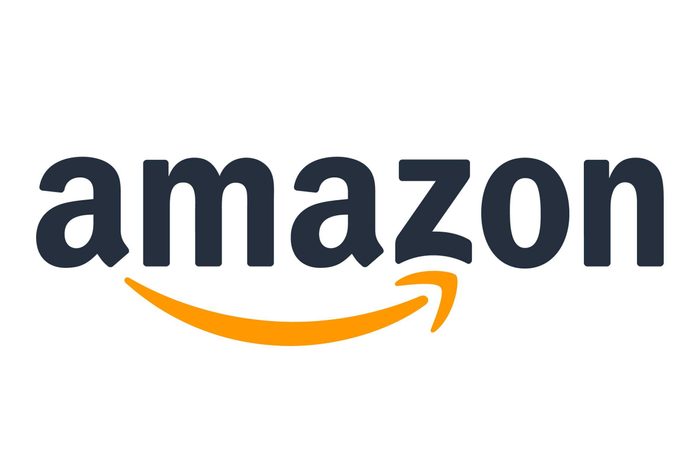
Amazon
Amazon is a staple in many online shoppers’ lives, but have you ever wondered what that little arrow at the bottom of the logo means? “The arrow in the Amazon logo conveys a smile—because who isn’t happy when we get our Amazon delivery?” Hesse says. “But it also bolsters the idea that you can find everything you could ever want on Amazon, from A to Z.”
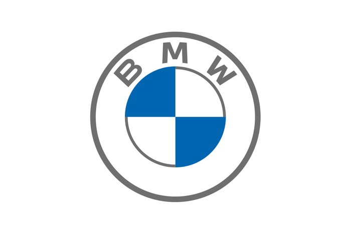
BMW
The luxury car manufacturer’s logo is known for its blue-and white colors: a nod to the flag of Bavaria, Germany, where the company is based. “Also, it is believed the four colored quadrants represent a spinning airplane propeller, reflecting the history of the company as a manufacturer of military aircraft engines from World War I,” says Marla Royne Stafford, PhD, professor of marketing at the University of Nevada, Las Vegas’s Lee Business School.
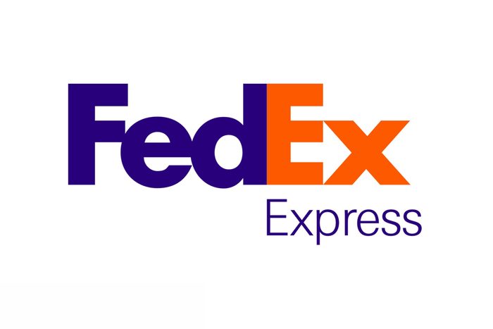
FedEx
The FedEx logo looks pretty normal at first glance, so it’s easy to miss the hidden message. Can’t see it? Look at the space between the capital E and the lowercase x—it’s an arrow pointing forward, perhaps to suggest speedy and accurate delivery.
This is one of Newman’s favorite logos, because it crafts the brand’s visual identity using both positive and negative space. “Part of the brilliance is that it transforms the brand’s logo from a visual mark to a visual experience upon each viewing,” he says. Plus, as Hesse points out, “once you see the arrow in the FedEx logo, it’s virtually impossible to unsee it from that point on,” making it hard to forget.
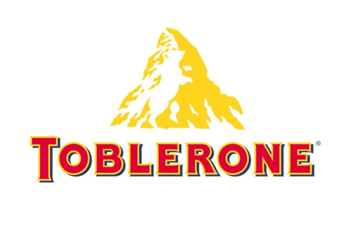
Toblerone
If you’ve snagged ever this delicious Swiss chocolate bar, you’ve seen the mountain on its logo. But wait—what’s that on the left side of the mountain? That’s right: It’s a bear. The bear is the official symbol of the Swiss town of Bern, the original home of Toblerone.
Like the FedEx logo, this one makes use of negative space. This time, though, it’s in the shape of a bear that appears to be doing some kind of dance … probably because he’s happy about eating chocolate!
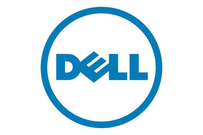
Dell
The sideways E in the Dell logo is more than just a creative way to set it apart from other logos. Michael Dell announced that the goal of his company was to “turn the world on its ear”—or, in this case, change the way that computers were processed and sold to customers. More specifically, Dell was the first tech company to allow customers to “build” a computer to their specifications online and have it delivered to them at home.
“Companies might include a hidden message in their logos to tell some type of story about the brand or its values, or simply to convey an idea to the audience,” Stafford says. And that’s likely what’s going on here.
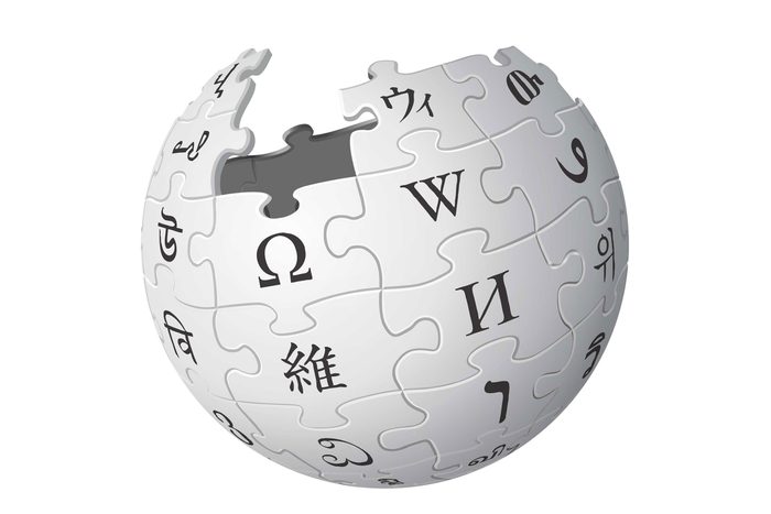
Wikipedia
Companies might include a hidden message in their logos simply to convey an idea to the audience. “When developed appropriately and carefully,” Stafford says, “these messages may communicate with their audience on a deeper level, fostering a connection between the product and the consumer, as well as an understanding of what the brand represents beyond its basic product.”
That’s the case with the Wikipedia logo. The unfinished globe, made of puzzle pieces with characters from various languages, represents the “incomplete nature” of the company’s mission to be the go-to information portal—and the fact that a site built on user submissions can never be complete.
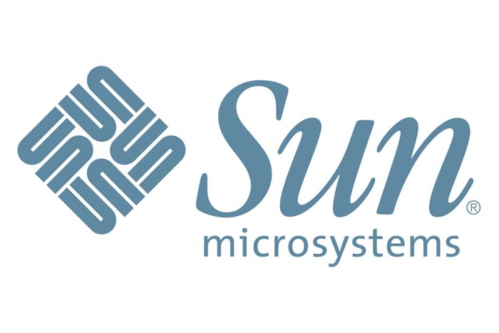
Sun Microsystems
While the font used for the company’s name has changed over the years, the ambigram—that’s the cube on its side with the word sun written multiple ways, depending on how you read it—has been there since the beginning. Technically, the square is composed of eight U-shaped elements, but no matter which way you turn it, it spells out the company’s name.
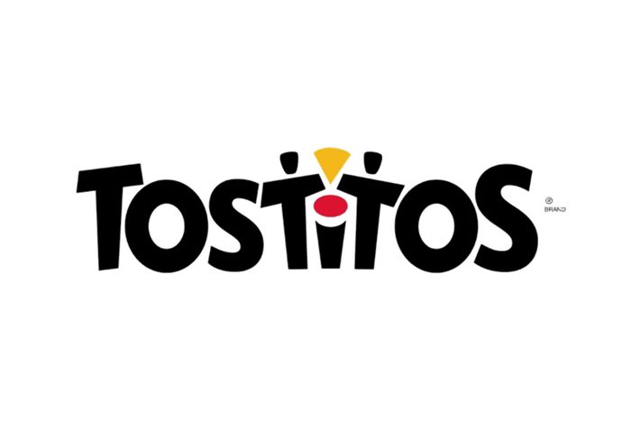
Tostitos
You may have thought the dot over the i was used to give the logo a pop of color, but it’s actually part of a hidden—and creative—message. The red dot is actually a bowl of salsa! Beyond that, the two T’s are people, and the yellow triangle in between them is a chip. It’s supposed to represent people coming together to share a tasty snack of chips and salsa. Logos like this one create what Hesse refers to as “memorability and talk value.”
That’s because there’s a “cool” factor to knowing things that might not necessarily be common knowledge. “Whether it’s a secret menu item at a fast-food restaurant or a hidden symbol within a logo, hidden elements create a sense of discovery that people enjoy sharing,” she explains.

Goodwill
You might assume the Goodwill logo contains a smiling face to represent how good it feels to clean your house, donate items and recycle clothes that you no longer use. But the face is also a larger version of the g in the word Goodwill, which appears at the bottom of the logo.
This is an example of a logo that works on two levels. “For a hidden message to be effective, it must be noticeable enough to be processed at some capacity, but it should not detract from the overall logo,” Stafford says.
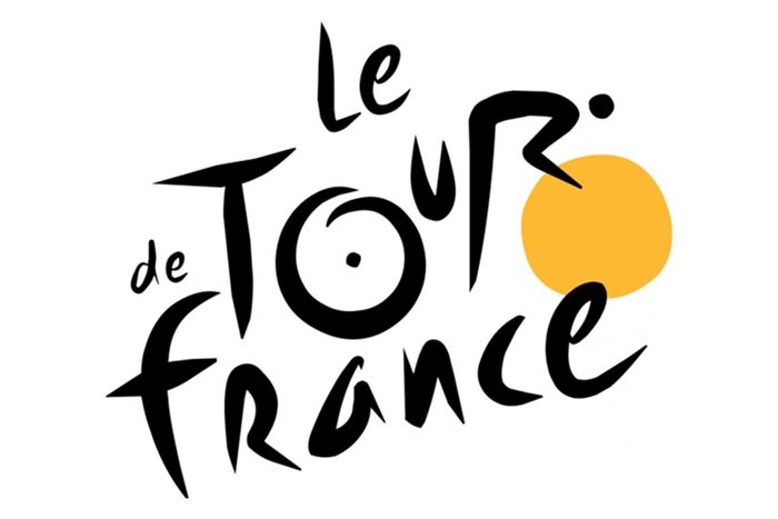
Tour de France
Does the yellow circle represent the sun? Nope! It’s actually a bicycle wheel. The R in tour is a cyclist, and the O is the back bicycle wheel. According to Stafford, subtle imagery, like the person on the bicycle, is one way companies convey hidden messages in logos.
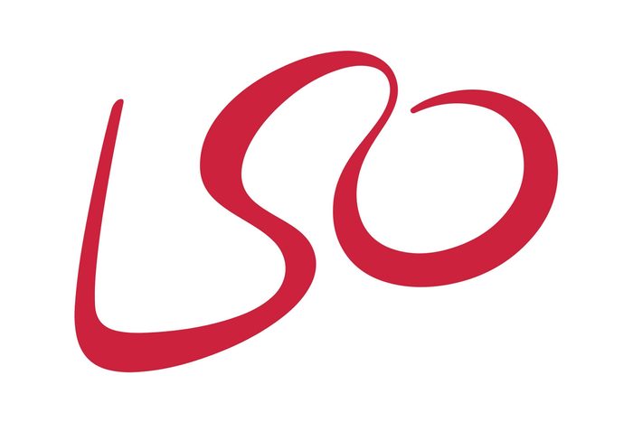
London Symphony Orchestra
We thought the three-letter abbreviation was written out in a fancy script font—but we were wrong. Not only is the logo an abbreviation of the London Symphony Orchestra, but it also represents a conductor: The L and the O are the arms.
The great thing about logos like this one, according to Hesse, is that there will always be someone who isn’t aware of the hidden message. That “creates an endless opportunity for that ‘wow’ moment with a potential customer,” she says.
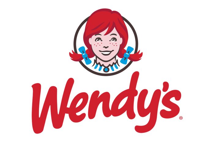
Wendy’s
At first glance, the Wendy’s logo looks pretty straightforward—but there is a hidden message in it. More specifically, there’s a secret word hidden in the collar of Wendy’s blouse. Look closely, and you’ll notice the word Mom written in the collar of her top.
“This was evidently done as a reference to the idea of a comforting, home-cooked meal like only your mother could make,” Hesse says of the rumors surrounding the hidden word. But higher-ups at Wendy’s say this secret message was actually unintentional.
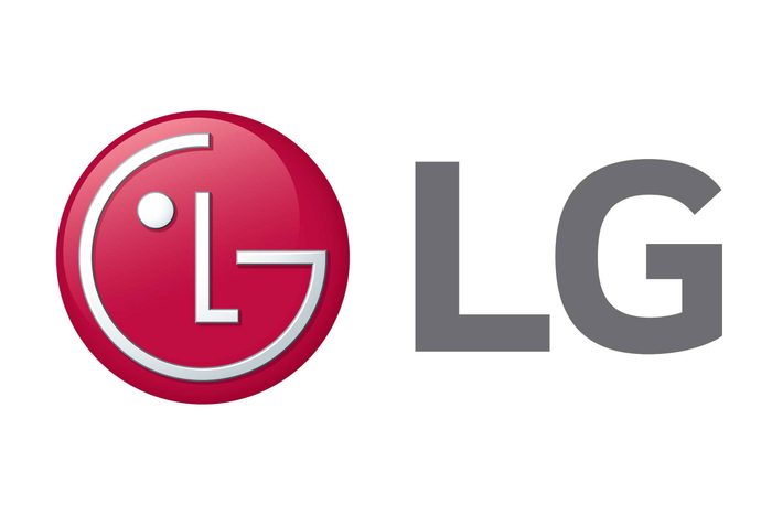
LG
There’s a long history with this one. LG started its life back in 1947 as the Lucky Chemical Co., Ltd., and was best known for Lucky Cream, a type of makeup. Meanwhile, an electronics company by the name of Goldstar was founded in Korea in 1958. Soon after, the Lucky Chemical Co. became the Lucky Group and acquired Goldstar—eventually changing its name to Lucky Goldstar in 1983. In 1990, the company’s initials, LG, became its name, and in 1995, it debuted a winking red smiley face dubbed the “Face of the Future.”
According to LG, the logo stands for the world, future, youth, humanity and technology. As for the one-eyed smiley face made with the L and G? It represents goal orientation, concentration and positivity.
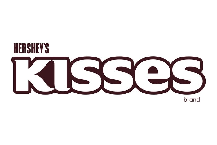
Hershey’s Kisses
The Hershey’s Kisses logo features the classic “Hershey’s” font, as well as almost balloon-like letters forming the word “Kisses.” But that’s not all. Look between the K and the I in the word Kisses. If you tilt your head to the left, you’ll see a sideways Kiss planted firmly between the two letters. Mwah! Logo perfection!
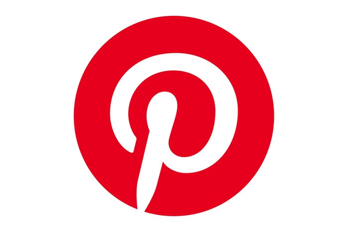
You may think this logo is pretty cut and dry, with a capital P placed in the middle of a bright red circle. But the company’s signature P also doubles as an illustration of a map pin. According to CNBC, one of the designers of the Pinterest logo didn’t want to add the visual of an actual pin, but the final look came together organically.
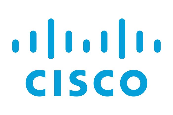
Cisco
At first glance, this logo looks pretty simplistic. The networking company’s name is plain as day under a line motif. But there’s more to this logo than meets the eye. According to Canva, those blue stripes represent an electromagnet as well as the Golden Gate Bridge, paying homage to Cisco’s namesake, San Francisco. Once you see the bridge in those lines, you can’t unsee it!
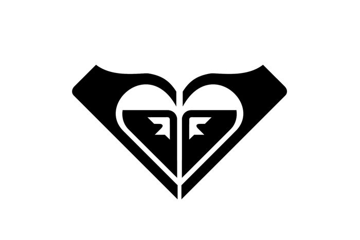
Roxy
As Quiksilver’s female fashion line, the logo was indeed designed to attract its desired demographic. But a closer look reveals so much more. The Roxy heart consists of two Quiksilver logos rotated to form the shape.
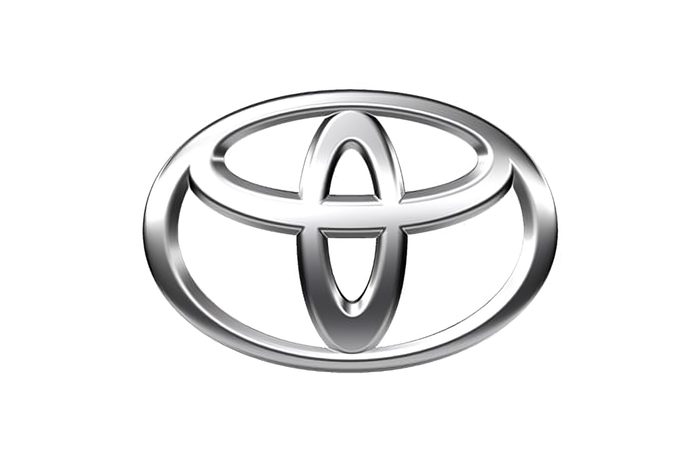
Toyota
Since 1989, Toyota’s logo has featured three overlapping rings that are believed to symbolize the unification of the hearts of the company’s customers and products, Stafford says. “Their technological advancement and the opportunities ahead are supposedly represented by the background space,” she explains. Additionally, the outer oval is meant to represent a steering wheel, symbolizing the vehicle itself.
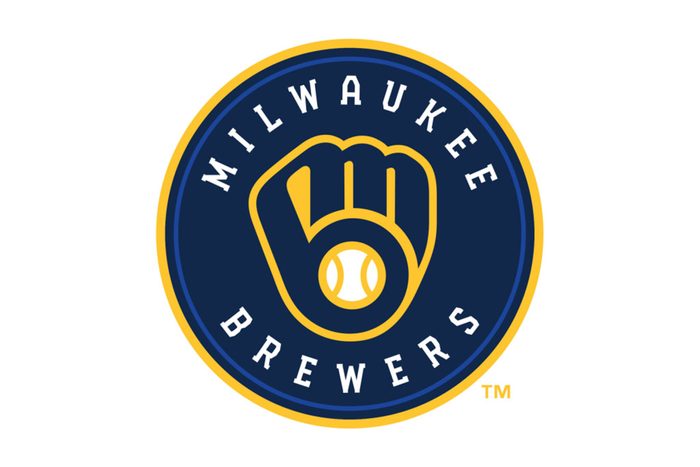
Milwaukee Brewers
The recently redesigned Milwaukee Brewers log is popular with fans for its modern look and connection to logos of the past. Specifically, a lowercase M and B form the glove, using the team’s initials in a creative way. And that’s not the only hidden message in the logo: According to the team, the ball in the middle of the glove symbolizes that their fans and their home are central to everything the organization does.

Unilever
Considering the Unilever logo is everywhere, you’d think we would have looked deeper at this interesting design. Most people just notice the letter U and its decorative motif. But upon further inspection, you’ll see the Unilever U uses symbols related to its extensive product offerings, like a spoon (food), lips (makeup) and water droplets (soap).
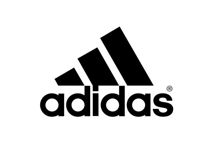
Adidas
With adidas in lowercase, bold type, most people focus their attention on the company name. But those diagonal stripes have meaning: They are intended to look like a mountain—the type of mountain elite athletes would push themselves to climb against all odds.
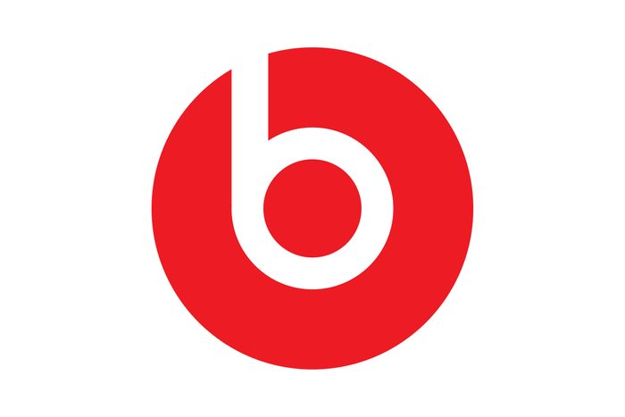
Beats by Dre
At first glance, it may appear as though this logo is simply a lowercase B, but there’s a hidden image in this logo. The circle that encapsulates letter actually represents a human head, and the B is meant to look like someone wearing the headphones (or at least one side of the headphones).
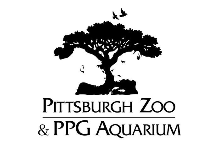
Pittsburgh Zoo & PPG Aquarium
The negative space in logos has so much potential, and this one uses it to the max. If you look at the white areas of the Pittsburgh Zoo & PPG Aquarium logo, you’ll find a gorilla and a lion looking each other in the eye. How cool is that?!
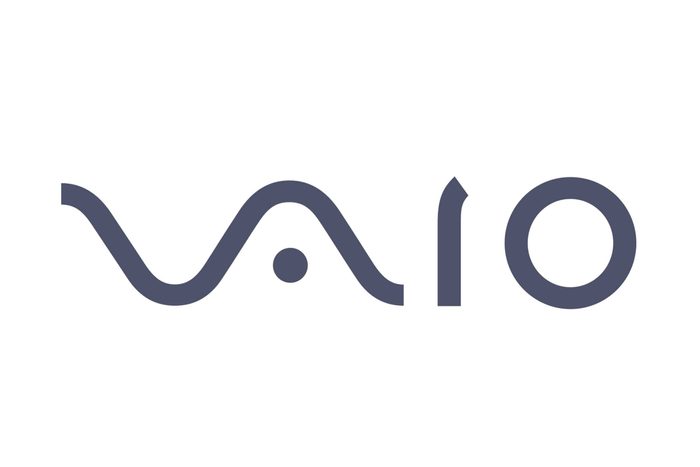
Sony Vaio
Here, you might think a designer got fancy with fonts when crafting the word Vaio, but yep—there’s a hidden meaning in it. Sony wanted the logo to represent the integration of analog and digital technology. According to Hesse, the V and A represent an analog wave, while I and O reference binary code. For those who aren’t tech-savvy, binary is a computer language comprised of ones and zeros.
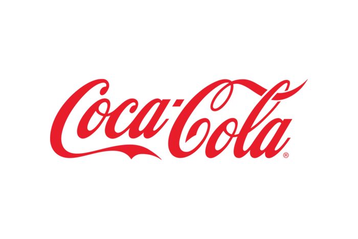
Coca-Cola
Is there a hidden meaning in the Coca-Cola logo? Stafford says there is: a “smile” created by the extended tail of the letter C. “This hidden message is long believed to symbolize Coke’s association with happiness and joy,” she explains. “If you recall, one of Coke’s slogan’s was ‘Have a Coke and a Smile,’ and this fits quite well with the hidden message of the smile.”
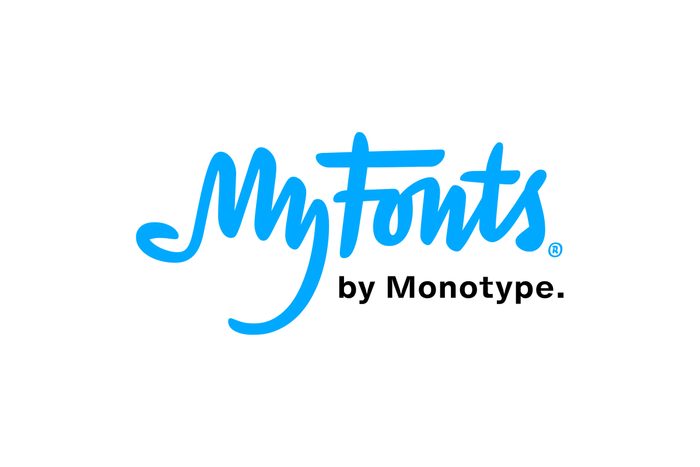
My Fonts
As its name suggests, My Fonts is an online resource providing a range of different fonts. According to Stafford, the My in the logo “resembles a hand, which is supposed to imply that users can get their hands on any font they want.” It could also be a reference to the fact that the first fonts we had were handwritten, not generated by a computer.
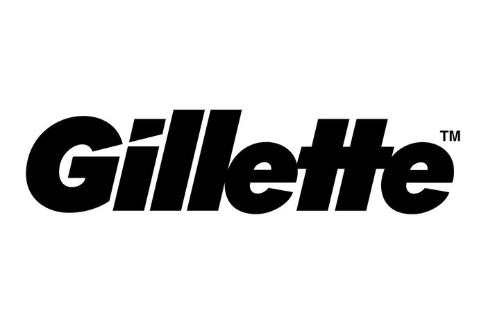
Gillette
This font looks sporty, with the slanted style lending itself to the notion of speed. Those slanted letters are angled that way to give off a “razor-sharp” feeling. On top of that, the G and the I have been cut to symbolize the brand’s signature product.
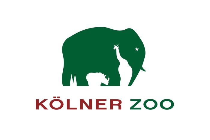
Kölner Zoo
The German zoo’s logo features an elephant with a star for its eye. But by now we should know there’s more than meets the eye when it comes to a zoo logo, and the Kölner Zoo logo is no different. In the negative space, you can spot a giraffe and a rhino, as well as the two spires that are symbolic of the Cologne Cathedral.
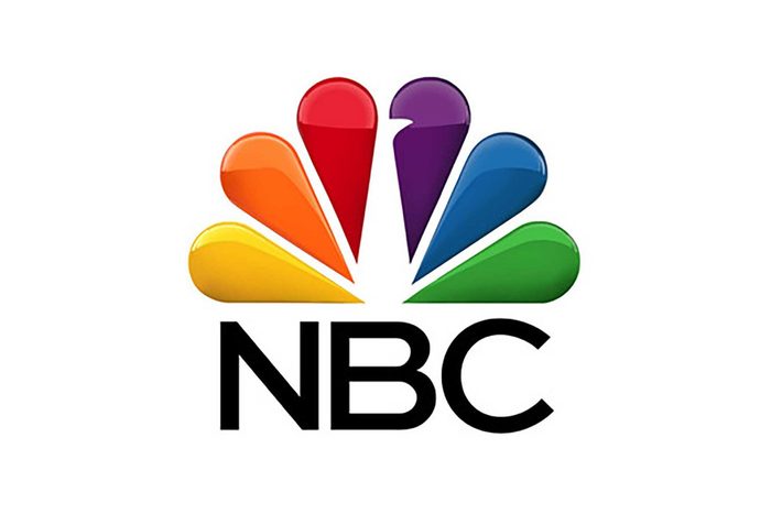
NBC
This is an example of a logo with a hidden message related to history, Stafford says. Given that the logo features a colorful peacock, we thought it referenced NBC’s nickname as the Peacock Network. Well, we weren’t entirely wrong. It’s definitely a peacock, but the six feathers have meaning: They represent the original six divisions of the network (there are tons more now, but the logo remains the same).
Plus, the peacock’s head is facing right, which is meant to symbolize the network’s eye on the future.
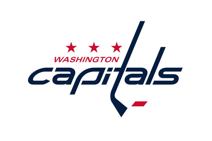
Washington Capitals
While a previous iteration of the Washington Capitals logo featured an eagle in red, white and blue with a silhouette of the Capitol building in the negative space, the NHL team switched things up for the 2024–2025 season. In honor of the team’s 50th anniversary, its logo for this season has 1970s retro vibes—not to mention a letter T that doubles as a hockey stick. The three stars represent Washington, D.C., Virginia and Maryland.

Ray-Ban
You may think the logo portrays the company’s name in a script font, providing a fashion-forward feel. Famous for its beloved sunglasses, Ray-Ban actually incorporates a subtle illustration of a pair of shades in the B. Just turn your head sideways to see it!
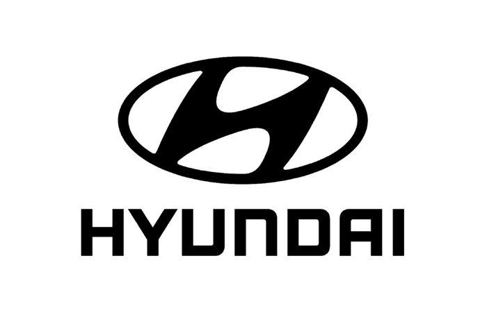
Hyundai
It’s a jazzy-styled H for Hyundai, isn’t it? Well, we assumed it’s slanted to insinuate speed, but we weren’t quite right. This logo is actually meant to represent two people shaking hands; one is a salesperson, and the other is a satisfied car customer. Out of all the logos with hidden meanings, this one is among the hardest to spot—which, according to Stafford, means it may not be doing its job. “It’s important to remember that these hidden meanings must be recognized and interpretable to be effective in some capacity,” she says.
London Museum
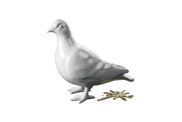
The Museum of London recently underwent a rebranding. It got a new, snappier name—London Museum—and a new logo, featuring a white clay pigeon and splatter mark from its poo. “A good logo gets people talking,” London Museum director Sharon Ament told the Museums Association. “Our pigeon, cast from London clay, and its splat, rendered in glitter, prompts people to reconsider London.”
The pigeon and splat represent “a place where the grit and the glitter have existed side by side for millennia,” Ament added.
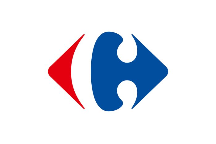
Carrefour
The French brand Carrefour sells everything from food and electronics to clothing and household items. Its name, appropriately, means “crossroads,” so it makes sense that the logo features two arrows (one red, one blue) facing opposite directions, with the letter C in the negative space in the middle, representing the name of the company. It’s a cool optical illusion that you might not notice at first!
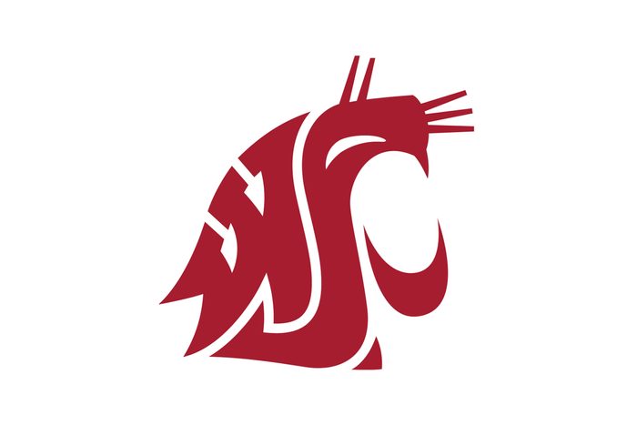
Washington State University
Located in the city of Pullman, Washington State University is the home of the Cougars. While it’s not surprising that its logo features the head of a cougar, what you might not realize at first glance is that it also contains three hidden letters: a W, an S and a U. How’s that for an added dose of branding?
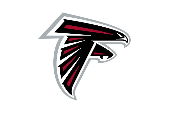
Atlanta Falcons
Not only does the NFL team’s logo feature a black-and-red falcon with its wing and talon outstretched, but it’s also positioned so that it makes a letter F when you look at it straight-on.
Additional reporting by Elizabeth Yuko.
About the experts
|
Why trust us
At Reader’s Digest, we’re committed to producing high-quality content by writers with expertise and experience in their field in consultation with relevant, qualified experts. We rely on reputable primary sources, including government and professional organizations and academic institutions as well as our writers’ personal experiences where appropriate. For this piece on hidden messages in logos, Kelly Kuehn and Elizabeth Yuko, PhD, tapped their experiences as longtime journalists who often write about knowledge and history for Reader’s Digest. We verify all facts and data, back them with credible sourcing and revisit them over time to ensure they remain accurate and up to date. Read more about our team, our contributors and our editorial policies.
Sources:
- Marla Royne Stafford, PhD, professor of marketing at the University of Nevada, Las Vegas, Lee Business School; interviewed, February 2025
- Reilly Newman, brand strategist at Motif Brands; interviewed, February 2025
- Jaclyn Hesse, co-founder of the branding firm Taillight; interviewed, February 2025
- New York Times. “Anywhere the Eye Can See, It’s Likely to See an Ad”
- Open Lab at City Tech. “Dell Logo”
- 1000 Logos. “Sun Microsystems Logo”
- ABC News: “Wendy’s Says Secret Message in Logo ‘Unintentional'”
- LG: “Brand Story”
- Major League Baseball: “Glove Story”
- Toyota: “Emblems”
- CNBC: “13 famous logos with hidden messages”
- Canva: “50 famous logos with hidden meanings”
- Museums Association: “Take splat: London Museum unveils pigeon-and-poo logo”